

 For this picture I color balanced my eyes to get a purple effect. I edited the contrast and the curves. I also sharpened the whole picture.

 This photo is representational of the song "The Shade of Poison Trees". To recreate this song in a picture, I used a tripod took a picture of myself under a tree in my yard. I cropped the photo so the tree and I were the only focal points. I then blurred the background and played with the color balance. I also darkened the edges and played with the curves a little to reach the final product.
 This photo was put together to show blue. I used a blue backdrop and a peacock feather as a prop. I used a blue border to make the blue pop. I also used other cool colors subtly, like the green and purple, but did not let them take over the picture. I played with the color balance and also adjusted the curves to add soft contrast. I like the picture as a diyptic because the two photos work very well together.
 To make red stand out in this picture, i used red lipstick, red nail polish, and a red dress. I used a white backdrop so no other color stood out. I also added a light contrast to both photos and played with the color balance. I made this photo into a diyptic and added a red border to make to red really pop.
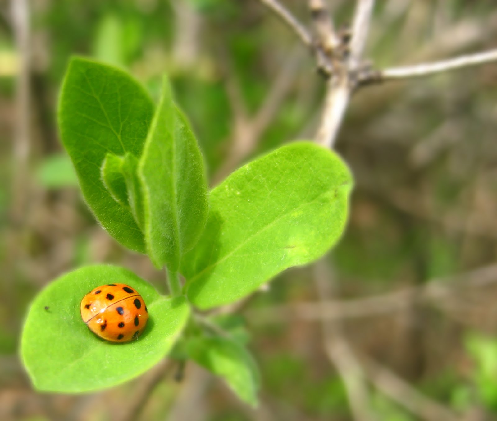
 For this picture, I dressed my model in green and had him sit outside in the green grass. I think the different shades of green really pop in this picture. For this photo i edited the color balance to bring out the browns and adjust his skin tone. I also played with curves to give it a soft contrast. To make him really pop, i blurred the background, but erased it over him, especially over his eyes and mouth to make him visibly clearer.
 This photo is my interpretation of the short story "The Yellow Wallpaper". The book is about a crazy woman who writes about her insanity while living in a rented house. The room in which she is staying in has horrid yellow wallpaper, which feeds her insanity. To represent the story, i used a notebook with writing and a pencil to symbolise her telling her story. She was an author and she loved to write but her husband banned her from doing so, which is why the pencil tip is broken. It also shows how her spirit has been broken. The withered flowers also have a double meaning. They are yellow to represent the wallpaper, but they are also withered to show her withering soul. For this photo i used the blur overlay effect, but instead of overlay I used soft lighting. I also burned the edges slightly to get a darker, more ominous feeling.

 This photo is used to represent repulsive. It may seem cliche, but my main focus was on the dirt which I find to be repulsive and disgusting. However, from dirt grows flowers which are attractive. I used a macro setting to focus on the dirt. I also played with the curves and the contrast and blurred the background more in photo shop. The only thing that really bothers me is how the stems are crooked.
 This photo represents attraction because it is considered beautiful and sexy to wear "in-fashion" shoes and heels. However, it can also be seen as repulsive because these types of shoes are painful to wear and are only worn for sex appeal. For this photo, i used a white backdrop and two different light sources. I had to clone stamp out a shadow that was distracting and cropped out unnecessary background space.
 To demonstrate something that is attractive, yet repulsive, I used mascara. It symbolises beauty and attraction, but at the same time is repulsive because of the fact that people use it because they are too self conscious. I used an auto white balance and focused on the streak of the mascara. I set up the lighting to create a shadow of the brush. I also adjusted the curves and brightened it, as well as upping the contrast.


